
Breeze
Less geeky formulas, more technology.
art direction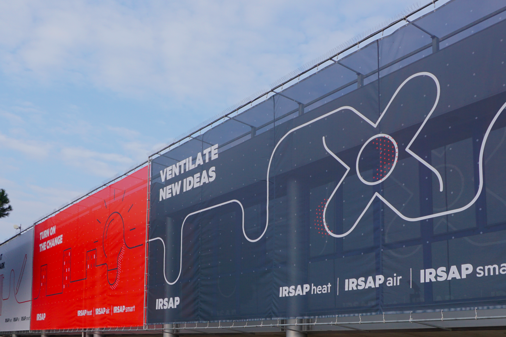
art direction
brand identity
catalogues
copywriting
corporate identity
illustrations
set design
strategy
Reconsidering brand positioning and defining its new identity.
A brand identity and communication strategy and path to build brand awareness in end users and professionals.
Simple forms, clean lines, clearly-outlined shadows and a moderate use of colour create an iconic, recognisable and versatile visual imagery capable of visually translating even technical concepts and information, making them easier to understand.


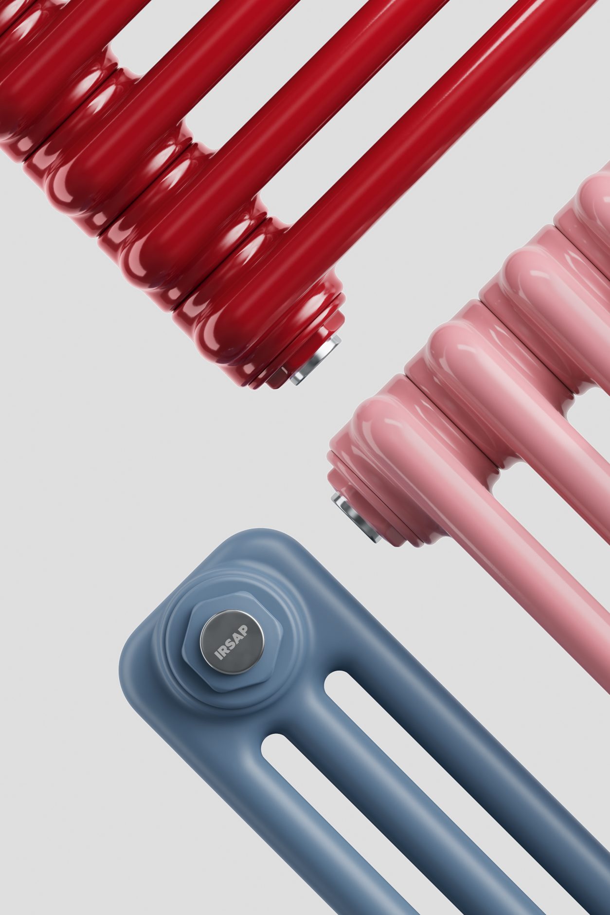
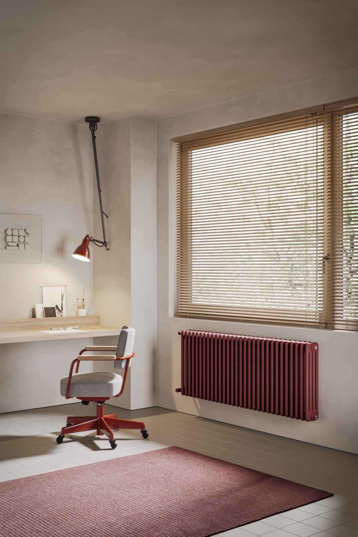
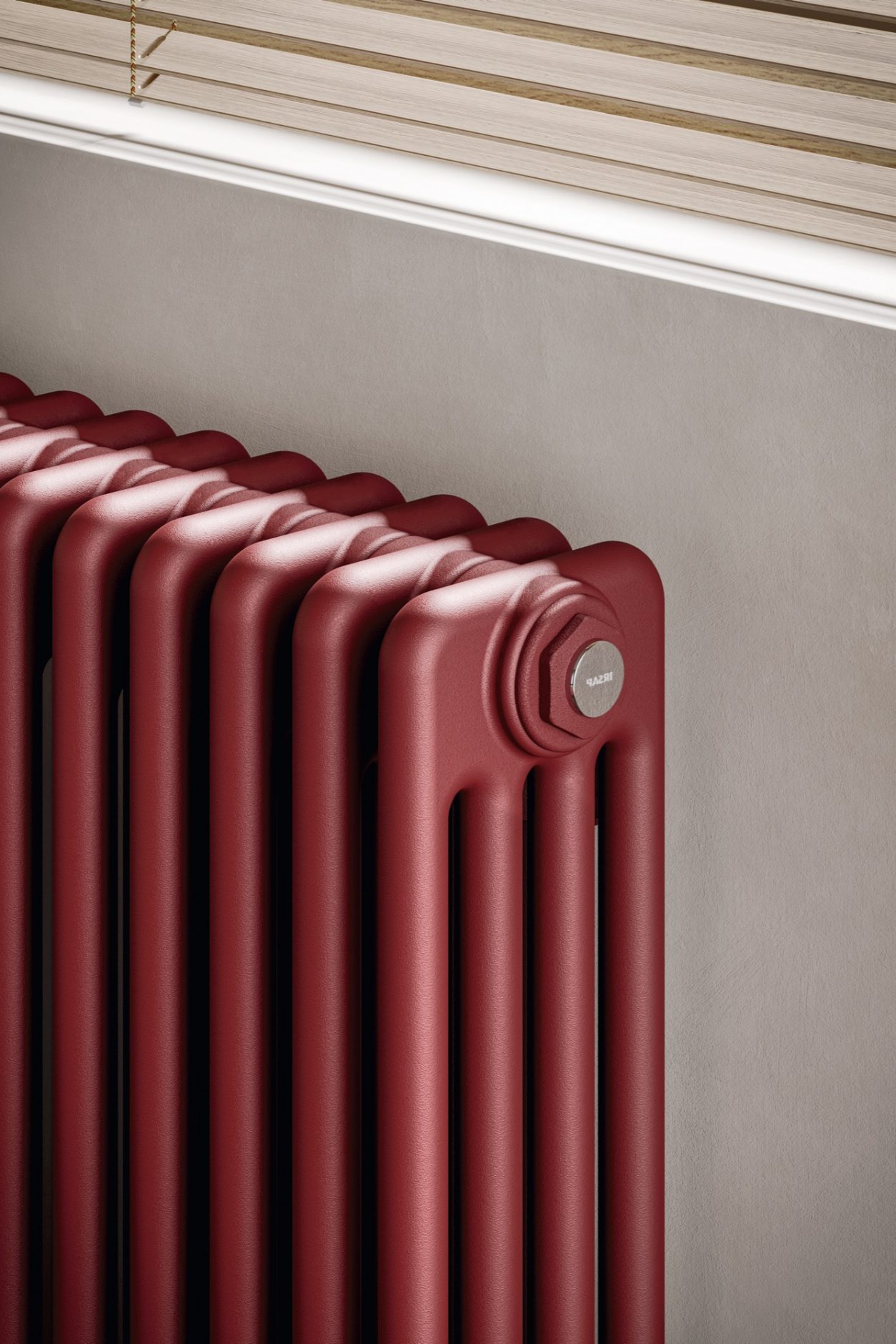
Technical, minimal, and impeccable still lifes bring the product closer to the hi-tech world, raising its perception: the radiator becomes a charming, desirable object crafted with the utmost precision.
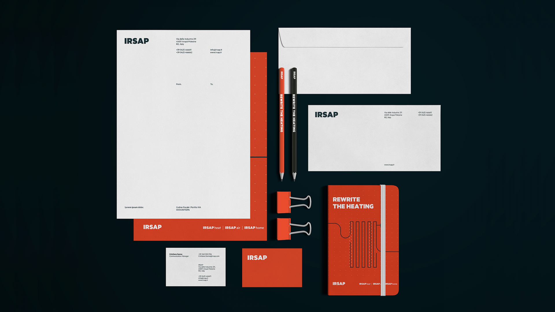
Structured on three levels - headline, subhead, and bodycopy - the copywriting reinforces IRSAP's leading position with bold headlines and a straight-to-the-point bodycopy.
Minimalist images focus the attention on the product thanks to settings with simple architectural details and specific styling. Lights and contrasts enhance the product’s forms.
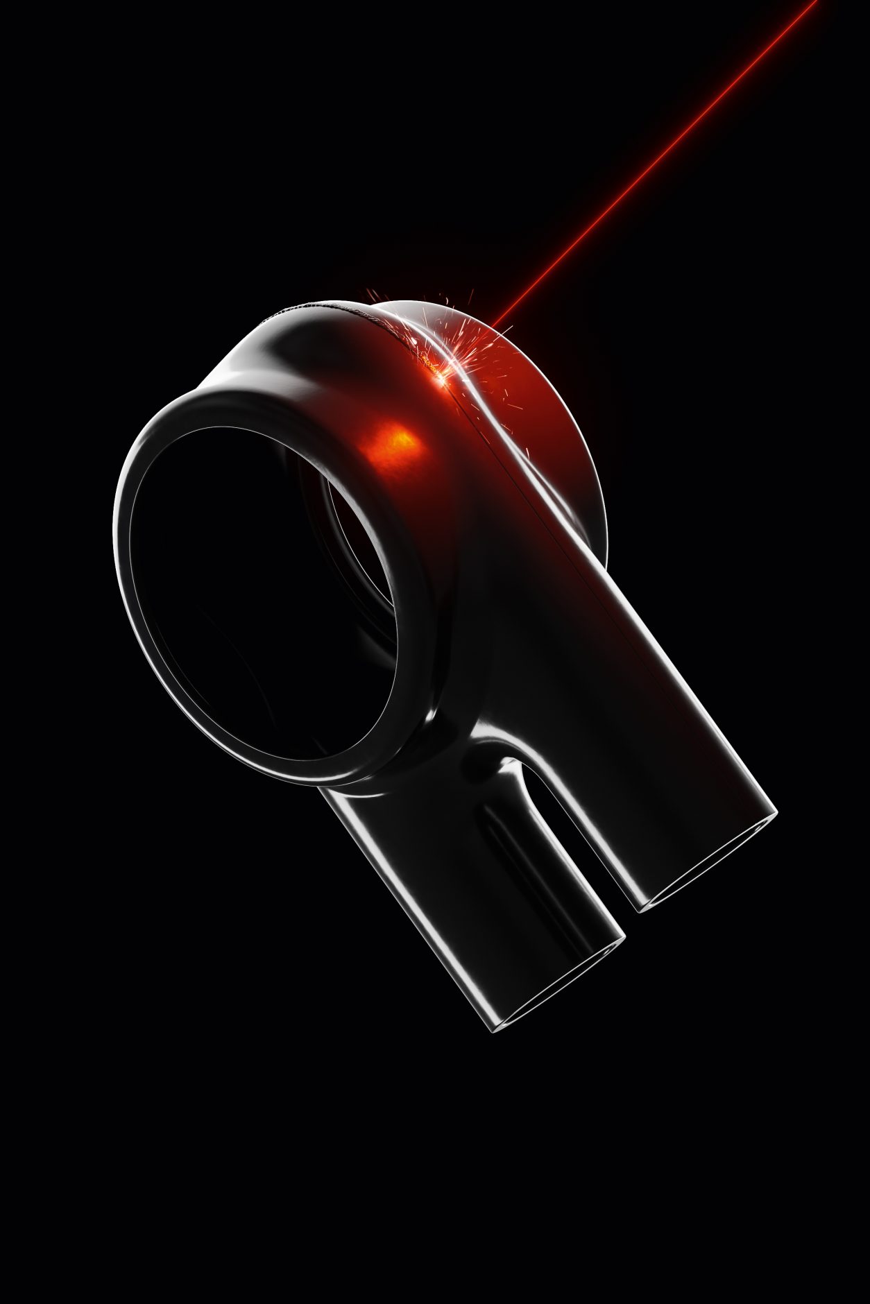
A tease to launch Polygon, the new IRSAP product, premiered at CES in Las Vegas. A tribute to the super-technological radiator's heart, narrated with still life and close-ups immersed in a dark background that enriches its profiles.
The new IRSAP catalogs and price lists format, a bold graphic layout where we distributed contents according to a new hierarchy.
Less geeky formulas, more technology.
art direction
A horizontal communication development strategy that not only narrates the product but also creates a functional and dynamic space focusing on people.
office furnitureGrazie di averci contattato, risponderemo al più presto.